
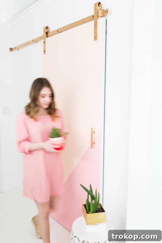
Embrace the Hue: A Guide to Pastel Color Block Walls for Modern Interiors
In the dynamic realm of interior design, few elements possess the transformative power of color quite like a well-executed paint scheme. It has the innate ability to dictate mood, define distinct functional zones, and inject a vibrant personality into any room. For those eager to revitalize their living environments without the daunting commitment of a full-scale renovation, the trend of color-blocking emerges as a brilliant and accessible solution. Specifically, integrating pastel color blocks offers a sophisticated yet playful aesthetic, seamlessly blending contemporary design principles with a serene and inviting charm. Whether you’re a seasoned DIY enthusiast or a newcomer eager to dip your toes into home decor, this comprehensive guide will inspire you to reimagine your walls with soft, captivating hues.
Color-blocking is a versatile design technique that involves strategically pairing two or more solid colors in distinct blocks, geometric shapes, or sections on a surface. While traditionally associated with bold, high-contrast palettes that make an immediate statement, its application with pastels introduces a softer, more inviting, and equally impactful dynamic. These gentle shades — think soothing mint green, romantic blush pink, airy sky blue, calming lavender, and warm soft peach — allow for profound creative expression without overwhelming the senses. They create an instant focal point, add incredible depth, and can subtly delineate different functional areas within an open-plan space. The true beauty of pastel color-blocking lies in its remarkable versatility, offering homeowners endless possibilities to personalize their homes with understated elegance and a distinct touch of modern artistry.
Why Pastel Color Blocks Are the Next Big Trend in Home Decor
The widespread allure of pastels goes far beyond their immediate aesthetic appeal; these soft hues carry inherent psychological benefits that contribute to well-being. These gentler, often desaturated versions of primary and secondary colors are widely known for their calming and soothing effects. This makes them an exceptional choice for bedrooms, nurseries, or any space where relaxation and tranquility are paramount. When thoughtfully combined in a color-block scheme, pastels defy the notion that they must be overly saccharine or childish. Instead, they can evoke a sense of refined modernity and sophisticated comfort, especially when artfully paired with minimalist furniture, natural wood textures, or elegant metallic accents. This harmonious blend creates an environment that feels both contemporary and deeply restful.
Beyond their universally calming properties, pastels are incredibly forgiving and adaptable. They are inherently less likely to feel overpowering, even when applied in large blocks, and can effortlessly complement a wide range of existing decor styles, from the clean lines of Scandinavian minimalism to the eclectic charm of bohemian chic. This makes them a perfect and safe choice for individuals who crave a fresh pop of color but are wary of committing to intense, saturated hues that might dominate a room. Moreover, pastel color-blocking offers a fantastic and low-risk way to experiment with color theory, allowing you to play with analogous (colors next to each other on the color wheel) or even subtle complementary shades in a visually appealing manner. It’s an accessible design trend that promises significant visual impact with relatively minimal effort, making it ideal for budget-conscious decorators and seasoned designers alike.
The DIY Advantage: Personalizing Your Space with Ease and Creativity
One of the most compelling and appealing aspects of color-blocking, particularly when utilizing a pastel palette, is its incredible DIY friendliness. Unlike intricate wallpaper installations or complex mural paintings, executing well-defined color blocks requires only basic painting tools and a reasonably steady hand. This empowers homeowners and even renters alike to confidently take control of their interior design narrative, adding a unique, handmade touch that authentically reflects their personal style and aesthetic sensibilities. The process itself can be incredibly rewarding, offering a therapeutic and creative outlet that culminates in a truly bespoke living space, brimming with character and individuality. It’s an opportunity to infuse your home with your own creative energy.
Opting for a DIY approach to color-blocking also translates into significant cost savings. Professional painting services can be quite expensive, but with just a few cans of high-quality paint, some reliable painter’s tape, and a set of brushes, you can achieve a sophisticated, high-end look on a very reasonable budget. Furthermore, for those living in rented properties, color-blocking offers a far less permanent commitment compared to painting an entire wall a single, bold color. Many color-block designs can be easily repainted or adapted when it’s time to move, or even creatively refreshed over time as your personal tastes evolve. This inherent flexibility and cost-effectiveness make pastel color-blocking an intelligent, stylish, and practical choice for modern, dynamic lifestyles.
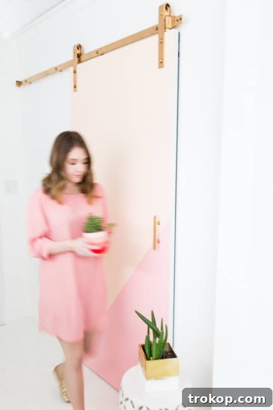
Our DIY Color Block Barn Door: A Dynamic Statement Piece with Flexible Charm
Sometimes, the boldest and most memorable design statements come in the most unexpected and functional forms. Our DIY color block barn door is a prime and inspiring example of how to introduce a significant pop of color with a lower, more adaptable commitment than painting an entire wall. Barn doors themselves are a fantastic architectural element, offering both a touch of rustic charm and modern space-saving functionality. By thoughtfully transforming one with a strategic pastel color block, you elevate it from a mere functional partition into a dynamic, movable piece of art that instantly brightens and characterizes a room. This approach allows for both practicality and aesthetic flair.
This design strategy is particularly clever because it allows the vibrant color to move and shift with the door itself, offering different visual experiences depending on whether it’s open or closed. It’s an ingenious way to experiment with a fresh color scheme without permanently altering a fixed surface. Imagine a soothing soft mint green paired with a delicate blush pink on the door, creating a captivating and vibrant focal point that can be admired from both sides. This project not only adds an aesthetic punch but also brilliantly showcases how ingenuity and thoughtful design can merge practicality with cutting-edge style, making a powerful, yet non-permanent, statement that is uniquely yours. It’s a testament to creative problem-solving in home decor.
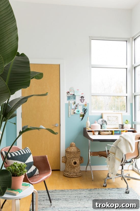
Brittni’s Office Walls: Sophistication Through Subtle Pastel Segmentation
The inspiration drawn from Brittni’s new office walls perfectly illustrates the understated elegance and profound impact of simple color-blocking. A half-painted wall, especially when rendered in a muted pastel shade, can dramatically alter the perception of a room without ever overwhelming it. This thoughtful design choice is particularly effective in an office setting or a dedicated workspace, where it can clearly define a functional zone, cultivate a heightened sense of focus, and add a professional yet inviting touch that boosts productivity and comfort.
By painting only the lower or upper half of a wall, you introduce a subtle yet impactful visual break that adds desirable dimension and contemporary interest to the space. This clever technique can strategically make ceilings appear higher and more expansive, or conversely, create a cozy, cocoon-like feel, depending on the precise placement and height of the color block. Utilizing a pastel in such a design brings a fresh, airy, and optimistic quality, fostering an environment that is highly conducive to creativity, concentration, and sustained productivity. It’s a powerful testament to the impact of thoughtful and deliberate color application – a seemingly small change that yields profound and sophisticated design results, creating a space that is both stylishly coherent and functionally astute.
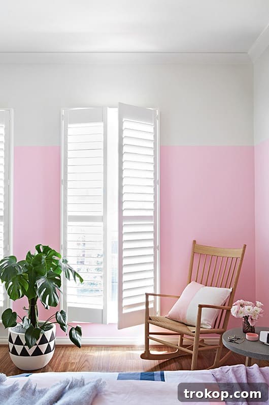
The Calming Embrace of a Pink Pastel Wall for Ultimate Relaxation
Imagine unwinding in a room where the very walls seem to whisper tranquility and comfort. The striking image of this stunning pink pastel wall instantly evokes a profound sense of calm and comforting serenity, making it an unequivocally ideal choice for a bedroom, a quiet reading nook, or any space primarily dedicated to relaxation and personal rejuvenation. Pink, particularly in its softer, more muted pastel forms, is widely and scientifically associated with feelings of peace, warmth, love, and emotional serenity. When applied in a strategic color block, it gracefully transcends a purely feminine aesthetic, offering a sophisticated warmth and understated elegance that can beautifully complement a diverse array of decor styles, from modern minimalist to soft contemporary.
This particular shade of pink beautifully demonstrates how a single, well-placed color block can act as a powerful anchor in a room, effortlessly drawing the eye and establishing a gentle, irresistibly inviting atmosphere. When thoughtfully paired with crisp white linens, natural wood tones, or soft grays, it creates a harmonious visual balance, expertly preventing the space from ever feeling overly sweet or cloying. The potential for a more restful sleep, enhanced relaxation, or simply a more serene and peaceful environment is genuinely palpable. It serves as a beautiful reminder that sometimes, the simplest and most thoughtful color choices can have the most profound and positive impact on our overall well-being and the overarching ambiance of our cherished homes. It’s about creating a personal sanctuary.
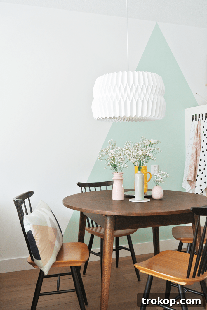
Mint Triangle Wall: Injecting Joy and Modernity with Geometric Pastels
When innovative design principles perfectly meet sheer delight, you get captivating creations like this truly inspiring mint triangle wall. This remarkable example flawlessly illustrates how dynamic geometric patterns, when softened and imbued with the gentle charm of pastel hues, can inject a playful yet incredibly chic and sophisticated energy into any given space. The deliberate use of triangles, rather than conventional straight lines or simple blocks, instantly adds a dynamic visual interest that gracefully breaks away from traditional, predictable wall treatments. Mint green, in particular, brings an extraordinarily refreshing, uplifting, and rejuvenating vibe, strongly reminiscent of tranquil nature and serene calmness.
This bold design choice is absolutely fantastic for spaces that genuinely need a significant dose of personality and creative flair, such as a vibrant child’s room, an inspiring creative studio, a lively entryway, or even a contemporary living area. The sharp angles and distinct forms of the triangles introduce an invigorating sense of movement and undeniable modernity, while the gentle pastel mint ensures that the overall design remains approachable, soothing, and never overwhelming. It’s a powerful testament to how thinking creatively outside the traditional “block” can lead to truly unique, visually stimulating, and profoundly inspiring results, transforming a plain wall into a captivating conversation starter and a constant source of daily happiness. Such artistic expressions prove unequivocally that functional walls can indeed also be magnificent canvases for self-expression.
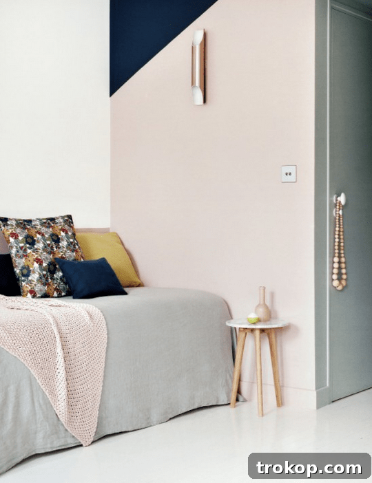
Parisian Chic: Professional Pastel Color-Blocking in Hospitality Design
If there’s one arena where design mastery and sophisticated styling truly shine without reservation, it is undoubtedly within the realm of the hospitality sector. This example from a chic Parisian hotel exquisitely exemplifies how expert interior designers thoughtfully leverage pastel color-blocking to meticulously craft an atmosphere of sophisticated elegance and understated luxury. High-end hotels consistently use color as a pivotal tool to evoke a specific mood, establish a unique brand identity, and create a memorable guest experience. In this instance, the carefully chosen pastel palette, likely combined with luxurious refined textures, bespoke furnishings, and minimalist architectural elements, speaks volumes about contemporary European design sensibilities and timeless style.
The application of color-blocking here is undoubtedly more nuanced and intricate than a typical DIY home project, possibly integrating custom millwork or seamlessly incorporating architectural features that effortlessly embrace the color blocks. However, the fundamental core principle remains consistently the same: utilizing distinct sections of harmoniously balanced pastels to add profound depth, distinctive character, and an overarching sense of refined calm to the space. This professional execution serves as an inspiring beacon for aspiring designers and homeowners alike, powerfully demonstrating that pastels are far from juvenile or simplistic; they are, in fact, incredibly powerful and versatile tools in creating environments that are both exceptionally welcoming and exquisitely stylish, leaving an indelible and lasting impression on every guest who enters. It’s about curating an experience.
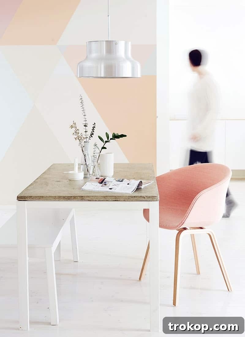
The Enduring Appeal of Geometric Walls with a Soft Pastel Twist
In the fast-paced and ever-evolving world of interior design, certain trends possess an undeniable and enduring appeal that confidently transcends fleeting fads and seasonal novelties. Geometric walls are unequivocally one such trend that has cemented its place in contemporary decor. When these crisp, sharply defined lines and precise forms are artfully imbued with the inherent softness of pastels, as spectacularly seen in this stunning example from Weekday Carnival, the resulting aesthetic is nothing short of breathtaking and visually captivating. The intricate interplay of sharp angles and gentle, muted hues creates a delightful visual paradox that is both intellectually stimulating and profoundly harmonious.
Geometric patterns, whether they manifest as bold triangles, elegant rectangles, intricate chevrons, or more abstract and free-flowing shapes, inherently introduce a powerful sense of order, modern sophistication, and dynamic visual interest. When thoughtfully paired with pastels, they miraculously lose any potential harshness or starkness they might otherwise possess, becoming approachable, inviting, and wonderfully adaptable. This refined technique is particularly effective in creating an immediate and undeniable focal point in any room, effortlessly drawing the eye and adding significant architectural interest without the necessity of structural changes or costly renovations. It’s a truly versatile and impactful option suitable for virtually any room, from a vibrant, welcoming entryway to a serene and calming bedroom, definitively proving that geometric walls, especially when softened by the gentle touch of pastels, are an unparalleled way to elevate your home’s aesthetic. The combination offers an artistic statement that is both distinctly contemporary and timelessly elegant.
Mastering the Art of Pastel Color Block Design: Practical Tips for Your Home
Feeling inspired by these beautiful and diverse examples of pastel color-blocking? Now it’s time to confidently embark on your very own creative journey to transform your living space. Here’s a curated list of practical tips to help you achieve professional-looking results and make your vision a reality:
1. Plan Your Palette Carefully and Thoughtfully
The very first step is to meticulously select your pastel colors. Begin by considering the existing furnishings, the amount of natural light the room receives, and the overall mood or atmosphere you genuinely want to create. Do you envision an analogous scheme (colors situated next to each other on the color wheel, such as mint green and light blue), a subtle complementary scheme (opposite colors that create a harmonious contrast, like soft pink and light green), or a refined monochromatic pastel look (different shades and tints of the same foundational pastel)? Gather physical paint swatches and observe them diligently in your room’s natural and artificial light throughout various times of the day. This crucial step is indispensable for accurately visualizing the final outcome and ensuring complete color harmony and cohesion.
2. Sketch Your Design and Visualize with Precision
Before even considering touching a paintbrush to your wall, meticulously sketch your proposed design on paper or digitally. Once you have a clear concept, use low-tack painter’s tape to carefully outline your proposed color blocks directly on the wall. This practical step allows you the invaluable opportunity to adjust proportions, fine-tune placement, and assess how the design interacts with existing furniture, wall art, and architectural features like windows or door frames. Live with the taped design for a day or two to ensure you absolutely love the layout and its overall effect. Taking photographs of the taped wall can also help you see the design objectively and make any necessary refinements.
3. Gather the Right Tools for Flawless Execution
Using quality tools makes an immense difference in achieving professional and crisp results. You will need:
- High-quality painter’s tape (FrogTape is often highly recommended for its ability to create exceptionally crisp lines by preventing paint bleed).
- Generous drop cloths or old sheets to thoroughly protect your floors, furniture, and any adjacent surfaces.
- A selection of small rollers for efficiently covering larger blocks and precise angled brushes for meticulously painting edges and corners.
- A reliable level and a sturdy measuring tape for ensuring precise, straight, and perfectly aligned lines.
- High-quality primer, especially if you are painting over a significantly dark color, a glossy finish, or if your wall has any minor imperfections that need smoothing.
- And, of course, your carefully chosen pastel paints! Opt for low-VOC paints for a healthier indoor environment.
4. Master the Technique for Crisp, Professional Lines
Achieving impeccably clean and crisp lines is paramount to the success of professional-looking color blocks. After meticulously applying painter’s tape to define your sections, firmly press down along all the edges of the tape to create a tight seal and effectively prevent any paint bleed. For an extra layer of crispness, some experts recommend painting a very thin layer of your base wall color (or a clear sealant) directly over the tape’s edge first. Allow this layer to dry completely. Once dry, proceed to paint your chosen pastel colors within the taped-off sections. Apply multiple thin coats rather than attempting one thick coat for a smoother, more even finish. Finally, remove the tape carefully and slowly while the paint is still slightly damp to prevent any unwanted peeling or tearing of the fresh paint.
5. Start Small and Embrace Experimentation
If you are relatively new to DIY painting or the concept of color-blocking, consider starting with a smaller, less daunting project. A neglected piece of furniture, an old canvas, a small alcove, or even a pantry door can serve as an excellent canvas for practice. This approach allows you to build confidence, refine your technique, and experiment with different color combinations before tackling a larger, more prominent wall. Remember, interior design is often an iterative and highly personal process; embrace experimentation, allow for creative evolution, and thoroughly enjoy the rewarding journey of transforming your space into something truly unique and reflective of you.
Conclusion: Unlock Your Home’s Full Potential with Serene Pastel Hues
Pastel color block walls offer a delightfully fresh, modern, and highly personalized approach to interior design, allowing you to infuse your home with distinct personality, subtle vibrancy, and a profoundly soothing ambiance. From the functional artistry and flexible charm of a DIY color-blocked barn door to the serene elegance of a precisely half-painted office wall, the possibilities for creative expression are as boundless as your imagination. This captivating trend seamlessly blends contemporary aesthetics with the timeless, calming appeal of soft colors, creating living spaces that feel both invigoratingly fresh and incredibly inviting, perfectly balanced for modern living.
Whether you opt for bold geometric shapes that make a striking statement, subtle and elegant stripes that add visual interest, or abstract color washes that evoke an artistic flair, the gentle charm and inherent versatility of pastels ensure that your design choices remain sophisticated, adaptable, and wonderfully timeless. So, take profound inspiration from these beautiful and diverse examples, gather your essential tools, and confidently embark on a rewarding creative journey. Your home is a magnificent canvas awaiting your personal touch, and with the exquisite palette of pastel color blocks, you possess the perfect means to paint a masterpiece that truly reflects who you are. Embrace the colors, transform your walls, and watch your living space come alive with understated elegance, joyful expression, and an undeniable sense of modern serenity.