
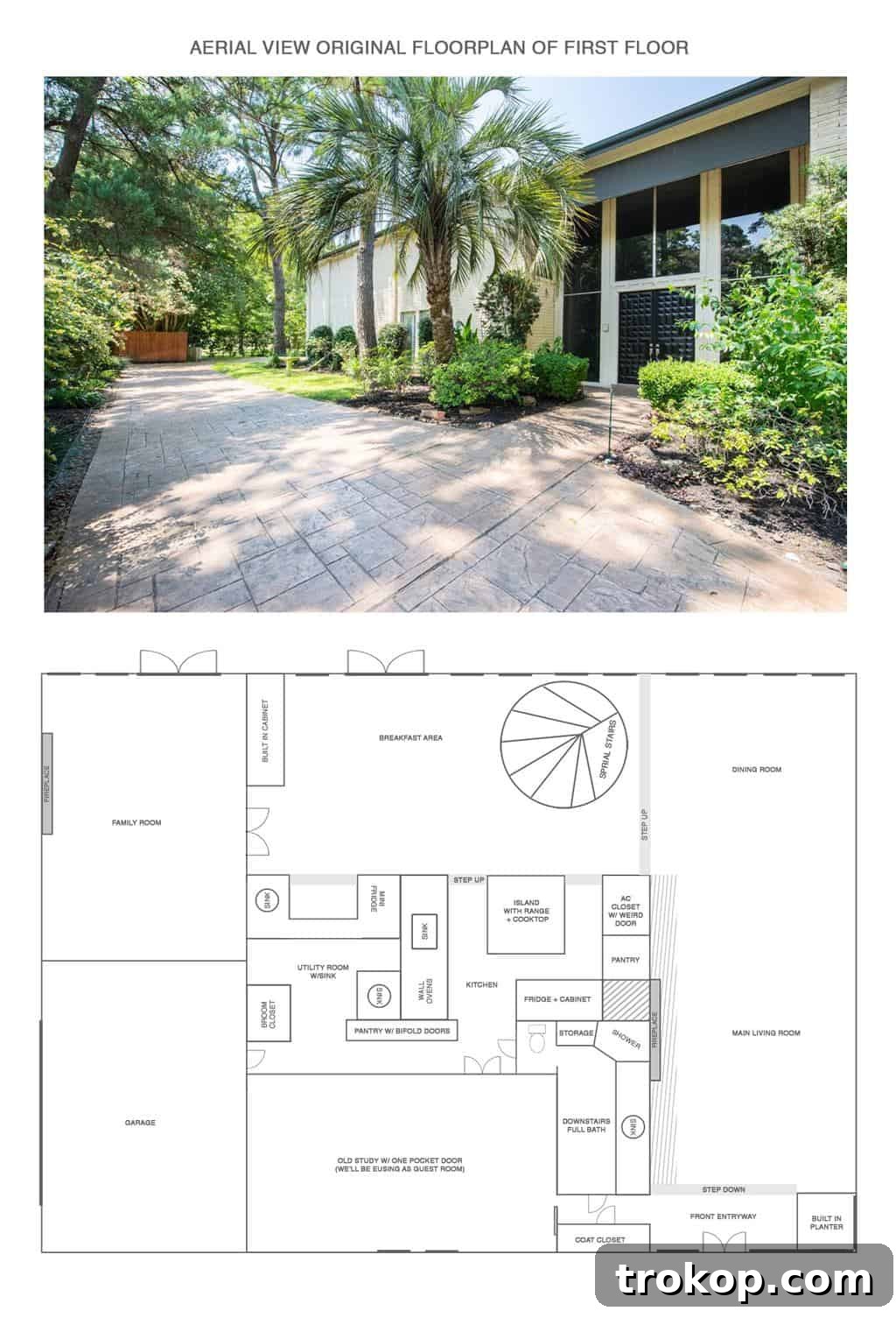
Ever wondered if a house could primarily be a labyrinth of storage cubbies with just a sliver of actual living space? The answer, as we discovered firsthand, is a resounding yes! We literally purchased such a home, embarking on a renovation journey that has been nothing short of transformative.
While my social media followers might have caught glimpses of our progress through Instagram stories, much of the foundational work undertaken by our incredible construction team, Genesis, isn’t particularly photogenic. Before we could even think about aesthetics, we faced a myriad of critical issues: completely repiping the entire house, overhauling all HVAC systems, rewiring the electrical infrastructure, and even addressing a complex sinking foundation problem. These essential, yet unseen, repairs form the bedrock of our renovation, ensuring the home’s longevity and safety before any cosmetic upgrades could begin.
I’ll delve into the lessons learned and what I might have approached differently with these major structural undertakings in a future post. But for now, amidst what has already been a demanding week – reflecting on my year in review – I thought nothing would be more uplifting and exciting than a visual tour of our evolving floor plans. It’s time to unveil the dramatic changes shaping our first floor.
Before we dive into the fascinating comparison of the old and new first-floor layouts, I must extend immense gratitude to our construction team at Genesis. Their patience with my evolving vision and constant design adjustments has been truly saint-like. The challenge, as many renovators can attest, is that certain layout quirks and functional inefficiencies often don’t become apparent until you begin the hands-on process of semi-designing and envisioning life within the space. What seemed acceptable on paper quickly reveals its flaws when you start imagining furniture placement, traffic flow, and everyday routines.
Table of Contents
The Genesis of Our Renovation: Unpacking the Original Floor Plans
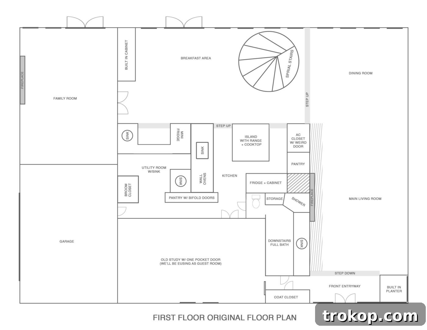
Our initial encounter with this house revealed a property that, while brimming with potential, was fundamentally structured in a way that defied modern living principles. The original floor plan, as you can see, was a testament to an outdated design philosophy, emphasizing an abundance of compartmentalized spaces and an almost obsessive dedication to storage. It felt less like a home and more like a maze of forgotten nooks and crannies, desperately lacking cohesive flow and open areas for family interaction.
A prime example of this design conundrum was the kitchen. Initially, I believed that simply rearranging appliances would solve its functional challenges. However, upon closer inspection and the beginning of design conceptualization, a stark reality emerged: the layout, even with appliance shifts, would leave us with a mere two upper cabinets for all our cups and glasses. This was an immediate red flag for practical daily living. While I appreciate the aesthetic appeal of popular open shelving, I wasn’t prepared to overhaul my entire collection of mismatched, beloved mugs and glassware just to accommodate a trendy design. Moreover, the thought of eating utensils exposed to dust or pet hair on open shelves always made me a bit squeamish – a minor detail perhaps, but one that significantly impacts daily comfort and hygiene for our family.
This critical observation led to one of our first significant structural decisions: closing off a doorway that connected the kitchen directly to the downstairs bathroom. This seemingly minor alteration had a profound impact, immediately liberating valuable wall space for much-needed upper kitchen cabinetry. This strategic move not only enhanced the kitchen’s storage capacity but also improved the overall functionality and aesthetic of the space. You’ll notice this crucial change, marked by a red bar, in the subsequent design iteration, symbolizing a pivotal step towards a more practical and livable home.
Strategic Transformations: Deconstructing and Redefining the Space
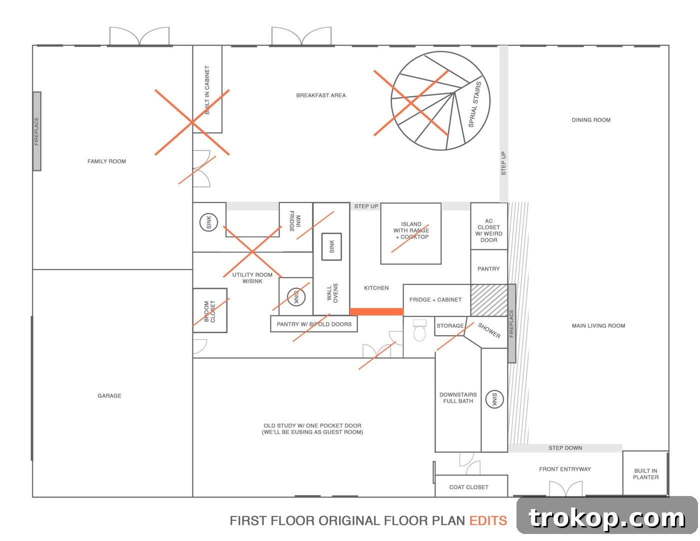
The journey from the original, fragmented layout to a more cohesive and functional living space involved numerous strategic edits and a substantial amount of demolition. Our aim was to strip away the inefficiencies and outdated features, paving the way for a design that truly supported our family’s lifestyle. Here’s a detailed breakdown of the major changes we embarked upon, each designed to unlock the home’s true potential:
- **Opening the Family Room:** One of the most impactful changes involved removing the wall that rigidly separated the family room from the breakfast area. This move was pivotal in creating the open-concept living space we desired, fostering a greater sense of connection and light throughout the main communal areas. The original wall here created a visual barrier, making both spaces feel smaller and disconnected. By removing it, we immediately injected a breath of fresh air into the heart of our home, promoting seamless interaction and a more spacious ambiance.
- **Replacing the Spiral Staircase:** The original 1974 spiral staircase, while perhaps a stylistic statement of its era, was impractical and unsafe, especially with children in mind. We decided to replace it with a kid-safe version, prioritizing both aesthetics and functionality. This upgrade not only ensured peace of mind but also significantly improved the flow between the first and second floors, transforming a hazardous feature into an elegant and secure architectural element.
- **Reimagining the Utility & Wet Bar Area:** A significant renovation involved removing the wall between the old utility room closet and the adjacent wet bar cubby. This was a straightforward decision since the laundry room had thankfully been relocated upstairs near the bedrooms prior to our move-in, creating an opportunity to repurpose this space. The original wet bar was a rather isolated and underutilized feature, disconnected from the main kitchen area. By removing the dividing wall, we envisioned a more integrated and functional space.
- **Optimizing Kitchen Workflow:** The existing kitchen layout was a labyrinth of inefficient appliance placements. Our renovation included a complete relocation of appliances to establish a much smoother and more logical workflow. This involved careful planning to ensure every element, from the refrigerator to the oven and dishwasher, was positioned for maximum efficiency, making cooking and meal preparation a far more enjoyable experience.
- **Scaling Back and Integrating the Wet Bar:** The original wet bar was not only awkwardly placed but also disproportionately large for our needs, often feeling cut off from the kitchen. We decided to scale back its size considerably and, crucially, open it up to the kitchen. This integration transformed it into a more functional and accessible extension of the main cooking and entertaining space, making it a natural complement rather than a standalone, isolated feature.
- **Introducing a Dedicated Mudroom:** The house originally featured a second small pantry which felt redundant given other storage solutions. We repurposed this area by replacing it with built-in mudroom storage. This addition provides a much-needed designated spot for stashing diaper bags, backpacks, shoes, and coats immediately upon entering from the garage, keeping clutter at bay and maintaining a tidy entryway.
- **Enhancing the Butler’s Pantry:** The existing butler’s pantry suffered from a lack of purposeful design, often serving as an unused second utility space. We transformed it by creating bespoke built-in storage solutions. This dedicated area now functions as a highly efficient and aesthetically pleasing zone for entertaining essentials, overflow kitchen items, or a discreet coffee bar, maximizing its utility and contributing to the home’s overall organization.
- **Planning for the Downstairs Bathroom Reconfiguration:** While our renovation budget necessitated tackling projects incrementally, we’ve already included plans for reconfiguring the downstairs bathroom and adjacent showroom. This future phase will focus on optimizing the layout for improved functionality and privacy. By including it in our visual plans now, we ensure a holistic design approach, even for projects slated for a later stage, emphasizing a cohesive vision for the entire first floor.
Realizing the Vision: Our New, Functional First Floor Layout
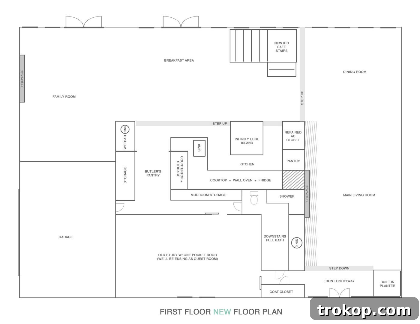
The culmination of our planning, demolition, and thoughtful redesign is a first-floor layout that feels dramatically different, imbued with a sense of purpose and seamless flow. Gone are the days of navigating a disconnected series of rooms; our new design fosters an intuitive and inviting atmosphere, perfectly tailored to modern family living. The image above illustrates this transformation, showcasing a home that finally feels cohesive and functional.
The kitchen, once a source of frustration with its limited storage and awkward connections, now boasts a much more normal and efficient workflow. The strategic decision to close off the direct doorway from the kitchen to the downstairs bathroom proved to be a multi-faceted win. Not only did this liberate crucial wall space for ample upper cabinetry – solving our “two cups” dilemma – but it also addressed a common pet peeve: bathrooms situated directly off the kitchen. The ability to avoid hearing (and smelling) everything from a bathroom while preparing or enjoying a meal is, frankly, a huge relief. This seemingly small adjustment drastically improved both the kitchen’s functionality and the overall comfort level for anyone using the main living spaces.
Moreover, the journey from the garage into the house is now smooth and practical, courtesy of our new mudroom storage. No longer do we contend with bags and shoes cluttering the entry; everything has its designated place, contributing to a tidy and welcoming arrival. The removal of the family room wall has created an expansive, light-filled open concept that encourages family gatherings and easy entertaining, truly transforming the heart of our home.
We are incredibly excited about how these changes have fundamentally reshaped our first floor. Every modification, from the grand structural alterations to the nuanced reconfigurations, has been driven by a desire for improved livability, enhanced functionality, and a beautiful aesthetic that reflects our personal style. This renovation has been a labor of love, a testament to patience, and a powerful reminder that with the right vision and team, even the most challenging spaces can be reborn.
In case you haven’t seen them yet, you can view all the original listing photos and our initial reactions in our new house announcement post. Stay tuned as I’ll soon be sharing the exciting floor plan changes we’ve made to the second floor, as well as the truly astonishing before-and-after reveal of our new Velux Skylights. The transformation continues!