

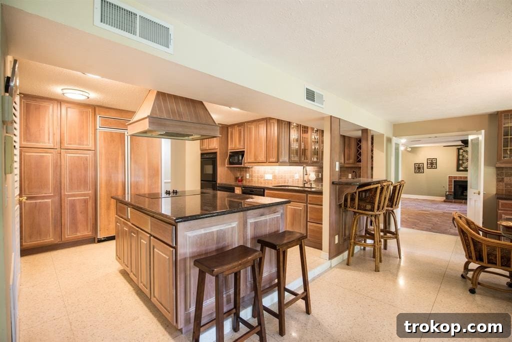
Embarking on a home renovation journey is often an exhilarating, yet challenging, endeavor. Our recent fixer-upper project was no exception, particularly when it came to transforming the heart of our home: the kitchen. The original space, as you might have glimpsed in our before photos, was frankly overwhelming – a chaotic mix of outdated features and structural peculiarities that made it feel cramped and uninviting. Our vision for this crucial space was clear: a minimal, modern kitchen design that prioritized functionality, brightness, and an open, airy feel. This article delves into the intricate planning and challenging execution behind our new kitchen design plan, detailing every decision from structural changes to appliance choices, and offering insights for your own home renovation.
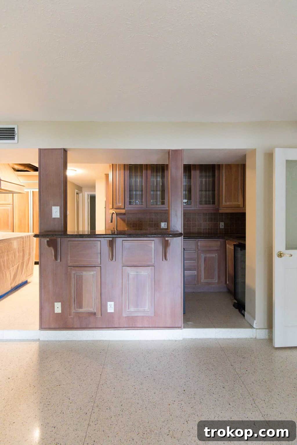
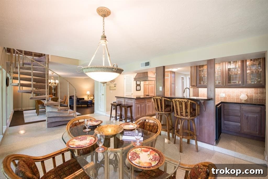
One of the most immediate and glaring issues we faced in the original kitchen was the imposing drop-down ceiling, necessitated by cumbersome ductwork. This architectural anomaly didn’t just look dated; it actively diminished the sense of space, carving up the room into smaller, less functional zones. It was a visual barrier that made the kitchen feel significantly smaller than it was, disrupting any potential for an open concept. Furthermore, the peculiar step-up into the kitchen area was a constant tripping hazard and an aesthetic inconsistency. While we harbored a deep affection for the existing terrazzo flooring – a true gem of mid-century design – and initially hoped to preserve it, we knew that some significant changes were inevitable to achieve our dream kitchen.
Our renovation priority list for this crucial kitchen transformation was meticulously crafted, reflecting both our aesthetic desires and functional necessities. These non-negotiables guided every decision, ensuring we stayed true to our vision:
- **Eliminate the Ceiling Drop-Down:** This was paramount. We were determined to remove the obstructive ceiling feature to open up the space, no matter the structural implications or cost. We envisioned a seamless, elevated ceiling that would allow natural light to flow freely and enhance the kitchen’s verticality.
- **Redefine the Wet Bar Flow:** The existing wet bar was an awkward, isolated cubby hole, severely underutilized and disrupting the overall flow. Our goal was to integrate it more seamlessly into the kitchen’s design, creating a versatile and inviting area that enhanced the social aspect of the home.
- **Maximize Brightness:** With no windows directly in the kitchen area, brightening the space was a critical objective. This meant careful consideration of color palettes, materials, lighting fixtures, and reflective surfaces to amplify light and create an uplifting atmosphere.
- **Smart Small Appliance Solutions:** Countertop clutter is a universal kitchen woe. We sought innovative solutions to house small appliances, ensuring they were easily accessible yet discreetly stored, preserving the clean lines and expansive feel of the countertops.
- **Embrace White and Gold GE Cafe Appliances:** This was a firm aesthetic choice, driven by a love for the brushed gold accents that perfectly complemented our modern yet warm design sensibilities. The GE Cafe series offered the perfect blend of sophisticated style and reliable performance for our new kitchen.
Any seasoned renovator knows the delicate balance between an ambitious wish list and a realistic budget. Our journey was no different. We partnered with Genesis CP, whose expertise was invaluable in navigating these financial realities and determining what was truly achievable within our scope. The decision to remove the ceiling drop-down, while critical to our design vision, came with a substantial price tag due to the necessary structural beam installation. However, the immediate visual impact and the long-term benefits of an open, unimpeded ceiling made it an investment we firmly believed was worth every penny for our kitchen remodel.
Once the demolition began and the existing cabinets were carefully removed, we encountered our first major hurdle: the much-loved terrazzo flooring. What we hoped to preserve quickly proved to be in incredibly poor condition, crumbling and non-existent under the previous cabinet installations and wall divisions. This discovery sparked “A LOT of debate” among us. The dream of integrating the original terrazzo into our modern kitchen design was slipping away. After extensive discussion and weighing all options, the most budget-friendly and practical solution for our flooring was to install the beautiful Stuga Studio wood flooring. This choice not only offered a consistent aesthetic with the rest of the house but also provided a durable and elegant surface laid over the newly patched, albeit compromised, terrazzo base.
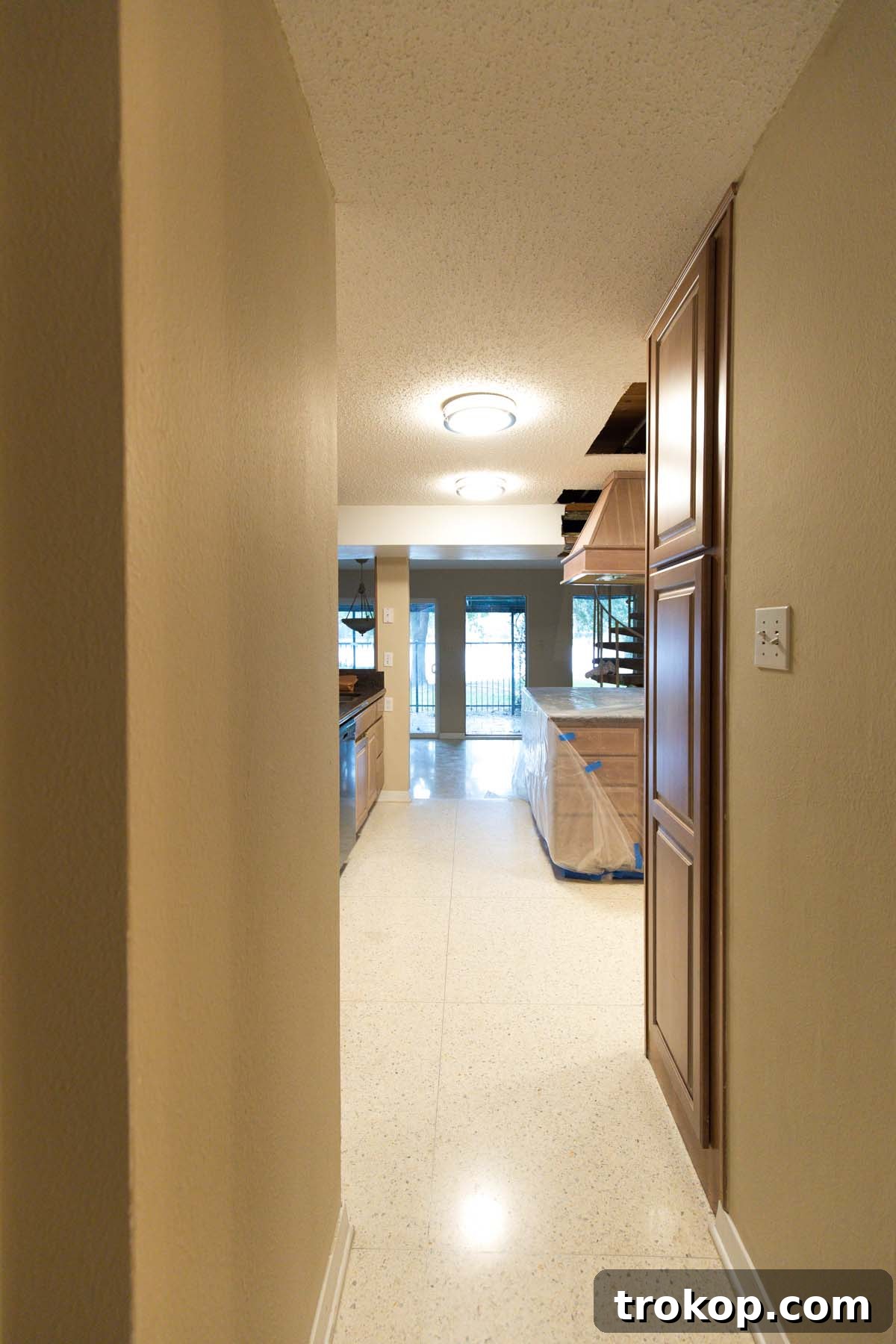
The strategic decision to economize on flooring allowed us to reallocate funds towards a more significant and impactful aspect of our kitchen renovation: a complete overhaul of the layout and flow. Understanding the revised floor plan is key to appreciating the transformation, and you can delve into the specifics in my dedicated floorplans post. This critical shift in budget allocation enabled us to implement fundamental changes that dramatically improved the kitchen’s functionality and connection to adjacent spaces. We intentionally closed off the redundant walkway to the left of the kitchen, as depicted in the before photos below, creating a more defined and purposeful kitchen zone. Simultaneously, we forged a brand-new entrance from the existing wet bar area into what was formerly the laundry room. This seemingly small change had a colossal impact on the home’s overall circulation and utility, redefining how we interact with the kitchen daily.
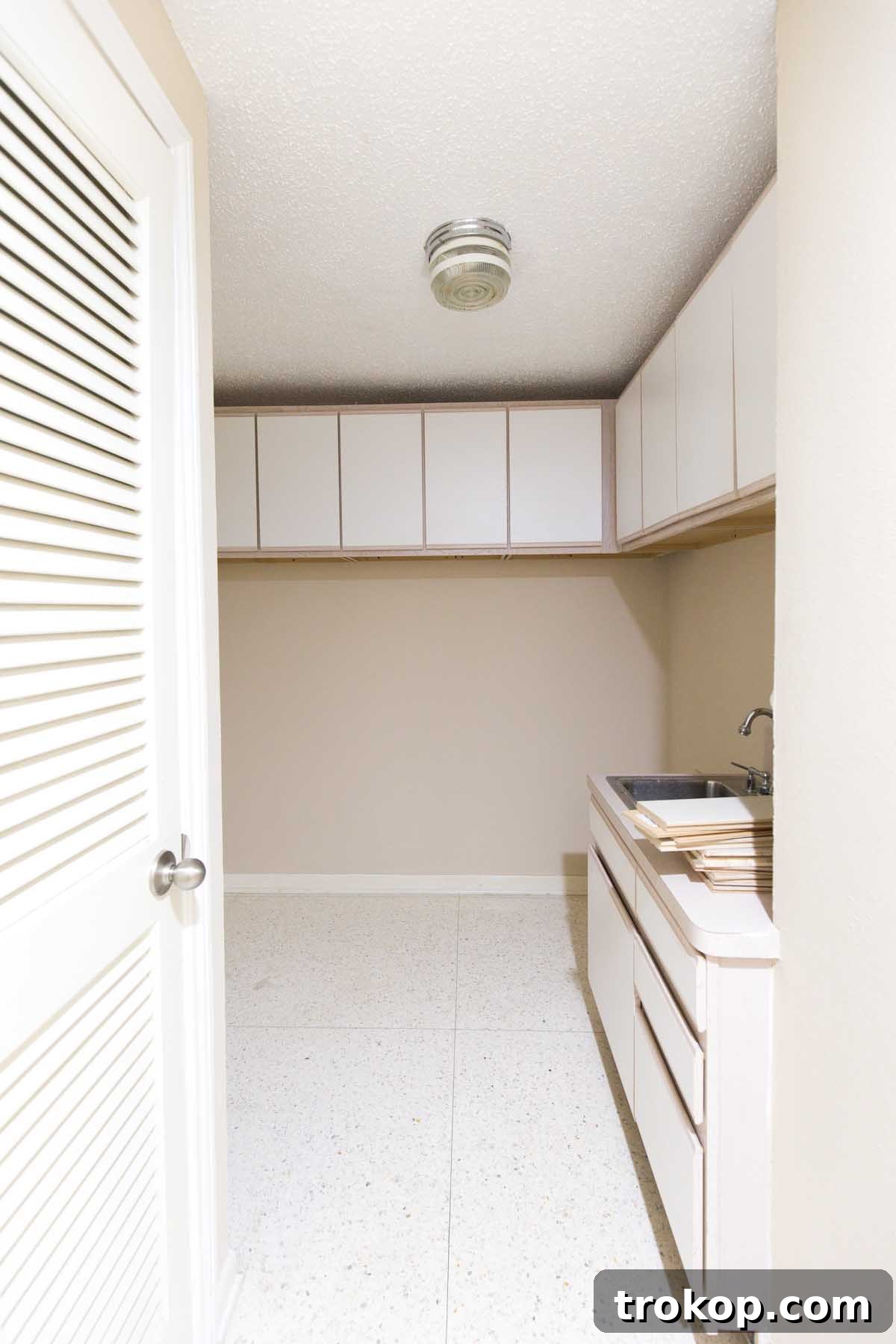
What was once the old laundry room, visible in the before photos above, has undergone a remarkable metamorphosis. It now serves as a highly functional walkthrough pantry, strategically positioned as the primary entry point from the garage. This clever design integrates a dedicated space for keys, mail, and everyday essentials, streamlining the entry process and enhancing the home’s organizational capacity. This thoughtful reconfiguration not only made the space infinitely more versatile for our family’s needs but also dramatically improved the flow and convenience of entering the house from the garage. It’s a testament to how intelligent kitchen layout changes can elevate the entire living experience.
When it came to cabinetry, our hearts were set on utilizing Semihandmade cabinet fronts. For years, we’d admired their reputation for producing sleek, high-end cabinet doors designed to perfectly fit standard Ikea cabinet boxes. This innovative approach offers the best of both worlds: the affordability and modularity of Ikea’s kitchen system combined with the custom, designer aesthetic of Semihandmade. Their fronts are not only user-friendly in terms of ordering and customization, but Semihandmade also provides excellent support, including white glove delivery and expert consultations to help homeowners select the ideal pieces for their kitchen design.
However, our experience revealed a crucial insight: while Semihandmade elevates the cabinet *fronts*, the foundational planning and installation of the Ikea kitchen planner system can be deceptively complex. From our firsthand experience, attempting to virtually build, precisely measure, and self-install the base of an Ikea kitchen without professional assistance is a monumental undertaking, fraught with potential pitfalls. We made that mistake once in a previous project, enduring numerous frustrations and even some marital stress! It’s safe to say we won’t be repeating that particular DIY challenge. Unless you possess exceptional DIY prowess or have an incredibly strong support system (and marriage!), we wholeheartedly recommend leveraging all of Ikea’s kitchen designer and planning services. Handing off the intricate installation specifics of Ikea’s modular system to professionals is an investment in peace of mind and ensures a flawless, upscale finish.
Ultimately, we couldn’t be happier with the sophisticated and custom look achieved using the Chris Loves Julia x Semihandmade shaker style cabinet fronts for our lower cabinetry. This choice perfectly embodies the mid-century modern aesthetic we aimed for, blending timeless design with contemporary appeal. The overall transformation is remarkable, elevating the entire kitchen to a new level of elegance and functionality. The final reveal of this stunning space is just around the corner, and we can’t wait to share it!
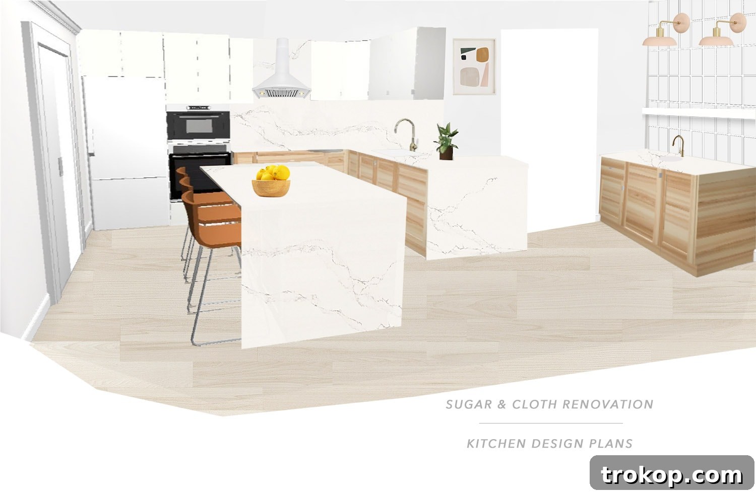
Sugar & Cloth Casa | Crafting Our Dream Kitchen: Design Plan & Material Choices
Selecting the perfect countertops was another pivotal decision in our kitchen design journey. Initially, we were drawn to Caesarstone Frozen Terra, largely because its subtle texture and color variations seemed to beautifully echo the original terrazzo floors we unfortunately had to cover. The idea was to retain a hint of that vintage charm, subtly integrated into our modern kitchen. However, upon viewing physical samples in the actual space, it became evident that Frozen Terra appeared significantly darker than anticipated. Given that our kitchen lacks direct natural light from windows, choosing a lighter surface was imperative to uphold our goal of maximizing brightness. This led us to pivot towards Calacatta Nuvo, a stunning quartz known for its luminous white base and elegant veining, which promised to deliver the radiant, airy feel we desperately sought for our kitchen countertops.
Our initial design concept for the countertops included an elegant infinity edge solely for the central island. This detail was intended to create a sleek, waterfall effect, adding a touch of contemporary luxury. However, as often happens in renovations, unexpected challenges arose. A necessary plumbing adjustment near the kitchen sink required us to create an unusual adjoining wall. Instead of commissioning a custom cabinet piece that might have looked disjointed, we saw an opportunity to extend the sophisticated aesthetic. We opted to incorporate a second infinity edge countertop in this area as well. This creative solution not only gracefully concealed the plumbing necessities but also provided a cohesive and unexpectedly luxurious design element, further enhancing the bespoke feel of our modern kitchen.
Despite the comprehensive overhaul, we were keen to retain a hint of the wet bar’s original charm and functionality. This was achieved through the incorporation of a stylish floating shelf accent wall situated on the right side of the kitchen. This strategic design element serves multiple purposes: it offers practical storage, displays decorative items, and most importantly, it anchors the space with a distinct aesthetic. I am incredibly excited about the prospect of styling this area, envisioning it as a vibrant focal point that adds personality and warmth to our otherwise streamlined kitchen design. It’s these thoughtful details that truly make a house feel like a home, balancing practicality with personal expression.
The journey from a dated, problematic kitchen to a bright, functional, and aesthetically pleasing modern kitchen has been transformative. Every choice, from the structural beam to the smallest accent, was made with careful consideration for design, budget, and lifestyle. We are thrilled with the outcome and can’t wait to unveil the final, fully styled space. Keep an eye out for the grand kitchen reveal, coming to the blog in the next two weeks! In the meantime, for those planning their own dream kitchen, here’s a detailed list of the exceptional products and materials that brought our vision to life:
- Caesarstone Calacatta Nuvo countertops and matching backsplash: Chosen for their luminous quality and elegant veining, ideal for brightening a windowless kitchen.
- 32-inch Derin Undermount Fireclay Sink in White from Signature Hardware: A classic, durable choice for the main kitchen sink.
- 19-inch Derin Round Undermount Fireclay Prep Sink in White from Signature Hardware: Perfect for the reconfigured wet bar, enhancing functionality.
- Terra Sconces from Cedar and Moss: Elegant wall sconces adding ambient light and style above the wet bar area.
- GE Cafe Series Refrigerator in Matte White with Brushed Bronze Hardware from Ferguson: Combines modern aesthetics with advanced features.
- GE Cafe Series Double Wall Oven in Matte White with Brushed Bronze Hardware from Ferguson: A powerful and stylish solution for all baking and roasting needs.
- GE Cafe Series Electric Cooktop in Stainless Steel with Brushed Stainless from Ferguson: Modern, sleek, and highly efficient for everyday cooking.
- GE Cafe Series Dishwasher in Matte White with Brushed Bronze Hardware from Ferguson: Seamlessly integrates with the appliance suite for a cohesive look.
- Chris Loves Julia for Semihandmade Shaker Cabinet Fronts: Custom-look fronts for lower cabinets, adding a refined, modern touch.
- Supermatte White Slab Cabinet Fronts by Semihandmade: Sleek, minimalist fronts for upper cabinets, enhancing the bright and open feel.
- Delta Touch2o Trinsic Sink Faucet in Brilliance Champagne Bronze: A touch-activated faucet combining convenience with elegant style.
- Delta Touch2o Soap Dispenser: A practical and matching accessory for a cohesive sink area.
- Stuga Studio Flooring in Oak Alpine: Durable and beautiful wood flooring chosen for its warmth and consistency throughout the home.
- AKDY White Rangehood: A powerful and discreet ventilation solution that blends seamlessly with the kitchen design.
- Sumner Street Finger Pulls: Minimalist hardware that complements the sleek cabinet fronts.
- Panel-Ready Warming Drawer from Ferguson: An integrated appliance for keeping dishes warm, maintaining the kitchen’s refined aesthetic.
- GE Cafe Microwave in Brushed Copper for the Appliance Closet: Tucked away in a dedicated appliance closet to maintain clean countertop lines.
- Abstract Art: Thoughtfully selected to add personality and a contemporary flair to the kitchen.
- Lemon Print: A cheerful and vibrant art piece contributing to the kitchen’s lively atmosphere.